This project is password protected
Re-structuring and desgining Designed Minds Website 2.0
Design Community Website
Designed Minds is a community of designers who connect, share, and grow together. Rooted in authentic, human-to-human connection, we gather to exchange stories, support one another, and build a more thoughtful design culture. For this redesign, the goal was to clarify our messaging and sharpen our voice—so that our values, tone, and invitation to new members felt as intentional as the community itself.
Client
Designed Minds
Duration
10 days (Fall 2024)
Team
1 Information Architect (Me)
1 UI Designer
1 UX Writer
1 Developer
Scope of work
Information Architecture
Content Strategy
Visual Direction
The Problem
A website that lost its identity
While the original Designed Minds site featured rich content and community-driven initiatives, its core message was getting lost in the clutter. The structure lacked clarity, and the voice didn’t fully reflect the warmth, authenticity, and personality of the community.

The Solution
Clarifying Identity through structure and storytelling:
To realign the website with Designed Minds' values, I took a structured, story-first approach focused on simplifying content and surfacing what matters most. By rethinking the information architecture and visual hierarchy, the goal was to address content overload, strengthen identity, and improve the overall user experience.
This work centered around three key objectives…
Define a clear narrative
Simplify and restructure content for clarity
Improve navigation and visual hierarchy
End Goal
A website that authentically reflects DM’s identity, fosters engagement, and makes it easier for new members to connect with the community.
The Process


What We Heard, and What It Meant
"The community has grown, and it means so many different things to different people."
"We want to preserve our values but refine how we communicate them."
Unclear Priorities
Over time, the site accumulated so much information that it became hard to tell what truly mattered.
No Clear Core Message
As the community grew, the website lost a unified statement that clearly communicated Designed Minds’ purpose and identity.
Unfocused Narrative Flow
The content lacked a clear throughline, making it difficult for new visitors to quickly understand the community and its value.
Deconstructing to Reconstruct
To move beyond surface-level insights, I dove deep into the existing website—dissecting the structure, language, and hierarchy to understand what Designed Minds was really trying to say.

This meant pulling the site apart piece by piece: mapping out page flows, scribbling over screenshots, and analyzing how the current messaging aligned (or didn’t) with the community’s evolving identity.
It wasn’t always neat, but this breakdown helped expose where the brand’s voice was getting lost—and revealed opportunities to bring more clarity, cohesion, and intention to the story they wanted to tell.
So, what did I discover?
While the website was filled with thoughtful content and genuine effort to reflect the community’s values, some of its core messages were getting lost in the mix. As the site grew over time, the visual hierarchy became harder to follow, and the messaging—though meaningful—lacked a clear throughline.
🔍 Clear on what we weren’t, but not who we were.
🤝 Missing the warmth and human-to-human connection aspect.
📝 Application was great as-is—no changes needed.
🧶 Site had good content, but lacked a clear narrative or story.
—————————————————————
Reshaping the Story
After breaking things down, it became clear: the site didn’t need more content—it needed a better way to tell its story. I reframed the information architecture to reflect the flow of a real conversation - starting with what someone new would want to understand first, then gradually revealing the deeper layers of purpose, people, and participation. The result is a structure that feels more human, authentic and more aligned with the community’s evolving identity.

So, what were some core changes?
01.
🧠 Before: Mission & Vision section buried in About page
✨ After: What We're Looking For and Expectations pages
→ Set a clearer tone from the start: we're a growth-minded, supportive community that values openness and vulnerability.
02.
🔍 Before: “DM Is Not...” section in the About page
✨ After: Who We Are section on the landing page
→ Shifted from reactive to proactive messaging—inviting, clear, and identity-forward.
03.
♻️ Before: Redundant sections like “Our Pillars” and overly detailed mission/value breakdowns
✨ After: Removed clutter and embedded values into tone and language throughout the site
→ Let the brand voice speak naturally instead of over-explaining.
Oh, and one thing I didn't touch? The application form.
The questions and format were already spot-on: thoughtful, unique, and a true reflection of the community’s values. I’m a big believer that not everything needs to change during a redesign—when something works beautifully, it should stay just as it is.
Building the Foundation
I started with low-fidelity wireframes to establish the core structure and layout of the redesigned website. These initial sketches helped visualize content hierarchy and navigation flow. As the design evolved, I refined them into mid-fidelity wireframes, incorporating clearer interactions and visual emphasis. These were shared with stakeholders to gather feedback, ensuring alignment with the community’s goals before moving into high-fidelity design and final implementation.

UX Writing Audit: Enhancing Community-driven Messaging
To reinforce Designed Minds' values of collaboration and inclusivity, I conducted a UX writing audit to refine key messaging across the website. Instead of positioning the community as a service that helps individuals, I shifted the language to emphasize shared experiences, mutual growth, and two-way conversations.
This included rewording prompts, simplifying complex statements, and replacing passive language with more engaging, community-driven messaging. These refinements ensured that every interaction on the site felt welcoming, supportive, and aligned with DM’s core mission.


Enhancing Engagement Through Messaging & Visuals
To make the website more engaging and dynamic, I replaced text-heavy sections with a mix of core messages and visuals. Instead of long paragraphs, key points were highlighted with concise text, supported by eye-catching graphics that make the content more inviting and easier to digest. This approach not only improves readability but also adds an element of fun and personality, making the site feel more aligned with the energy of the Designed Minds community


Visual Direction Ideation: Communicated Through Graphics
Beyond refining messaging, I also initiated ideas for custom graphics to enhance the website’s storytelling and engagement. This approach ensured that visuals weren’t just decorative but played a role in reinforcing key messages and making the site feel more dynamic.

Designed With, and For, the Community
Output
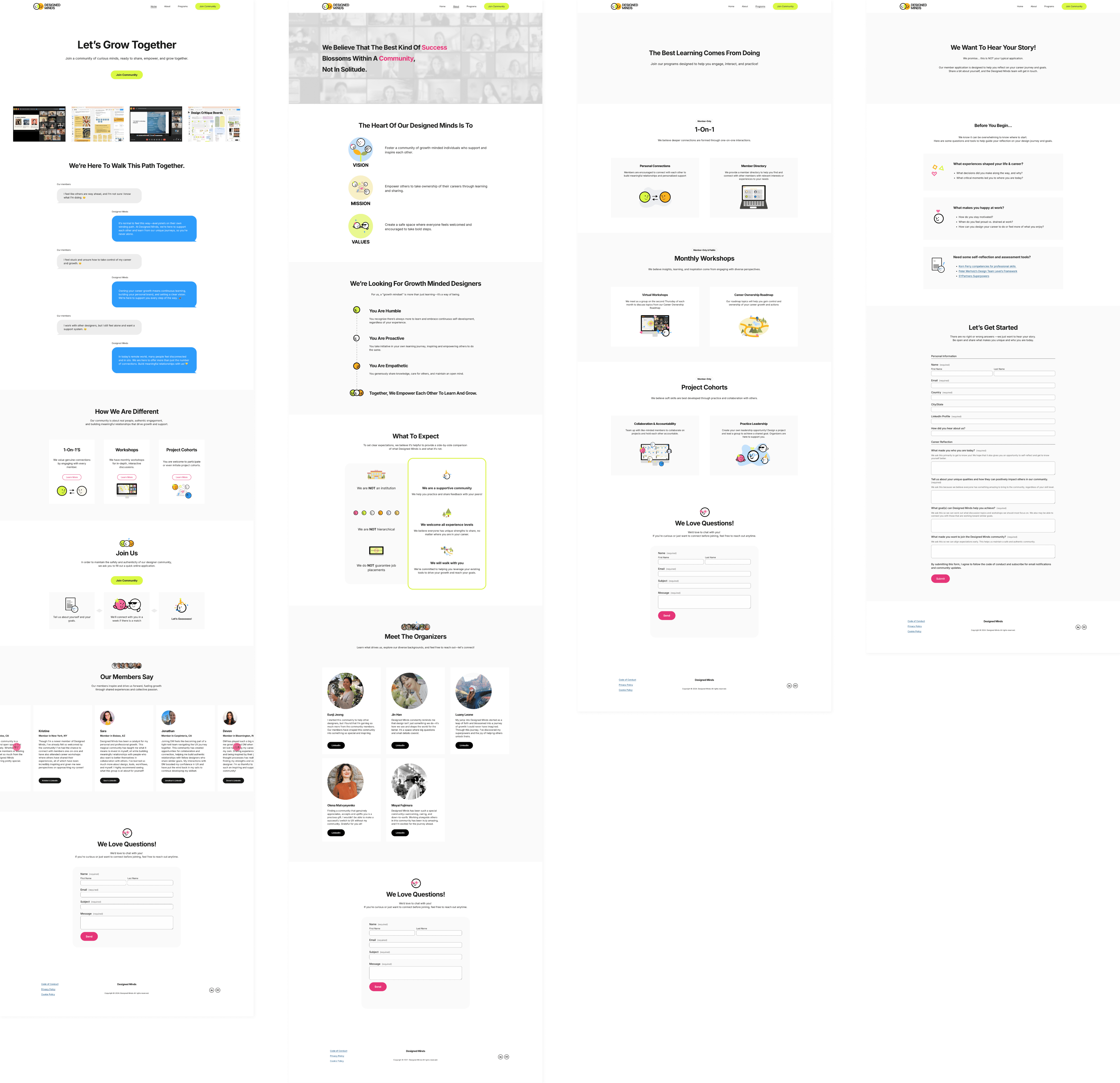
Designed Minds Website 2.0
The redesigned website now better reflects Designed Minds’ values—through a clearer structure, refined messaging, and a warmer, more human visual experience.
Check out live: https://www.designedminds.co
Outcome
Clarity, Connection, and Community
We’ve heard from both existing and new members that the redesign feels intuitive and inviting. Their feedback confirmed that the changes not only enhanced usability but also brought our values and identity into clearer focus.

Key Takeaways
The Power of Fresh Perspectives
This project reinforced just how valuable a fresh perspective can be. Sometimes, stepping back and looking at something with new eyes reveals opportunities for clarity that were hiding in plain sight. It also reminded me that content refinement is never a solo endeavor—collaboration was at the heart of every decision.
Working alongside the team to bring Designed Minds 2.0 to life was not only rewarding, but also a powerful reminder of what’s possible when shared purpose drives the process. I’m excited to keep shaping this community in ways that feel intentional, inclusive, and real.